2nd March 2017

Picking the right kind of chart to make your point is like telling a joke. If you have to explain it, you’re doing it wrong. Chris Bower, Creative Director and User Experience Lead at Kinduct, says the platform offers clients a number of ways to present data in charts or graphics but says the best way to make optimal use of the technology is to “go for the simplest visualization possible.”
Showing a graphic or a chart to a busy coach to help inform their decision making is a bit like making an elevator pitch. You have to put it in the most easily digestible visual possible,” Bower said. “The visual has to make the point and also reveal the data so that the coach can verify it if they want.”
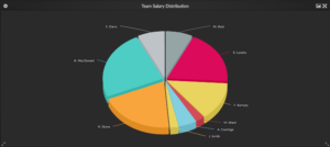
Take a pie chart for example. It is best used to show how something is divided up among players. What portion of team salary a player represents would be a good use of the pie chart because if you took something away from one player, you could conceivably give it to another. It would be less effective for showing a ranking in something such as shooting percentage, for example, or a player’s height or weight. Additionally a pie chart, or a bar graph, wouldn’t be very useful to illustrate data where a player’s contributions in categories is relatively equal because it’s difficult to perceive slight variations.
Something like a bubble graph can show the effectiveness of off-ice recovery methods or the impact that supplements or sleep can have on a player’s performance. It incorporates two pieces of data and can show how much rest a player had and how well they performed. It’s reasonable to assume that a well-rested player performs better, but correlation does not equal causation. If one can detect a pattern in data, then you can make a stronger case.
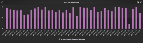
Bar charts work best if there is a maximum achievable such as playing time for a basketball player. The top of the chart should be equal to the maximum and any unrealized performance should be illustrated by space. As with a pie chart, trying to compare things with a bar graph that show things that are relatively equal is ineffective because the differences in the size of the bars is not easy to notice. Something like a scatter plot or a line chart that can zoom in will make a smaller variance in date more noticeable.
When athletic performance staff collect data, they do it not only to help inform their decisions, but they also influence conversations higher up the chain of command. Picking the right visual helps them quantify all the work they’ve been doing and all the observations they are making.
With a little common sense, picking the right visual can make a lot of hard work extremely valuable by improving player performance. There’s also the potential to have even greater impact on team performance by influencing coaching strategy and player usage.
In the weeks ahead, please keep an eye out for the next segment on how visualization helps drive insights and results.
Related articles